Home Service Website Design Tips to Turn Mobile Visitors Into Leads
A home service website usually gets judged in seconds, and on a phone, those seconds feel even shorter. Someone with a leaking pipe, a failing AC system, a tripped breaker, or storm damage on the roof is not settling in for a long browsing session. They want to know three things fast: do you serve their area, can you help with their problem, and what is the easiest way to contact you right now.
That is what makes mobile-first thinking so important in home service website design. A beautiful desktop layout means very little if the mobile version hides the phone number, loads slowly, or buries the quote form under a stack of oversized images. For trades businesses, good design is not decoration. It is friction removal.
I have seen the same pattern across websites for contractors again and again. The sites that convert mobile visitors tend to feel simple. Not bare, not sloppy, just obvious. The next step is clear. The contact options are easy to spot. The service area is stated plainly. The page does not fight the visitor.
Mobile visitors are usually trying to make a quick decision
On a laptop, a prospect might compare several companies, read every service page, and spend time digging through reviews. On a phone, the behavior is tighter. Most people scroll with one thumb, skim, and tap the first thing that looks trustworthy and convenient. Google’s own guidance lines up with this reality: important information should appear above the fold, navigation should stay simple, pages should load fast, and actions should take as few steps as possible.
That advice sounds basic, but it gets ignored all the time in contractor website design. A surprising number of contractor sites still open with a giant image, a vague slogan, and no immediate path to call or request service. For a restaurant or a design studio, maybe that kind of cinematic opening can survive. For roofing website design, HVAC website design, plumbing website design, or electrician website design, it creates drag at the exact moment the visitor wants momentum.
When someone lands on your homepage from a local search result, a Google Business Profile, or a Local Services ad, the mobile page should answer practical questions immediately. If it does not, the back button Scalable Websites website design is always one thumb tap away.
What belongs at the top of the mobile page
The most valuable space on a phone screen is the first view before the visitor starts scrolling. This is where many home service websites either win trust quickly or waste the visit.
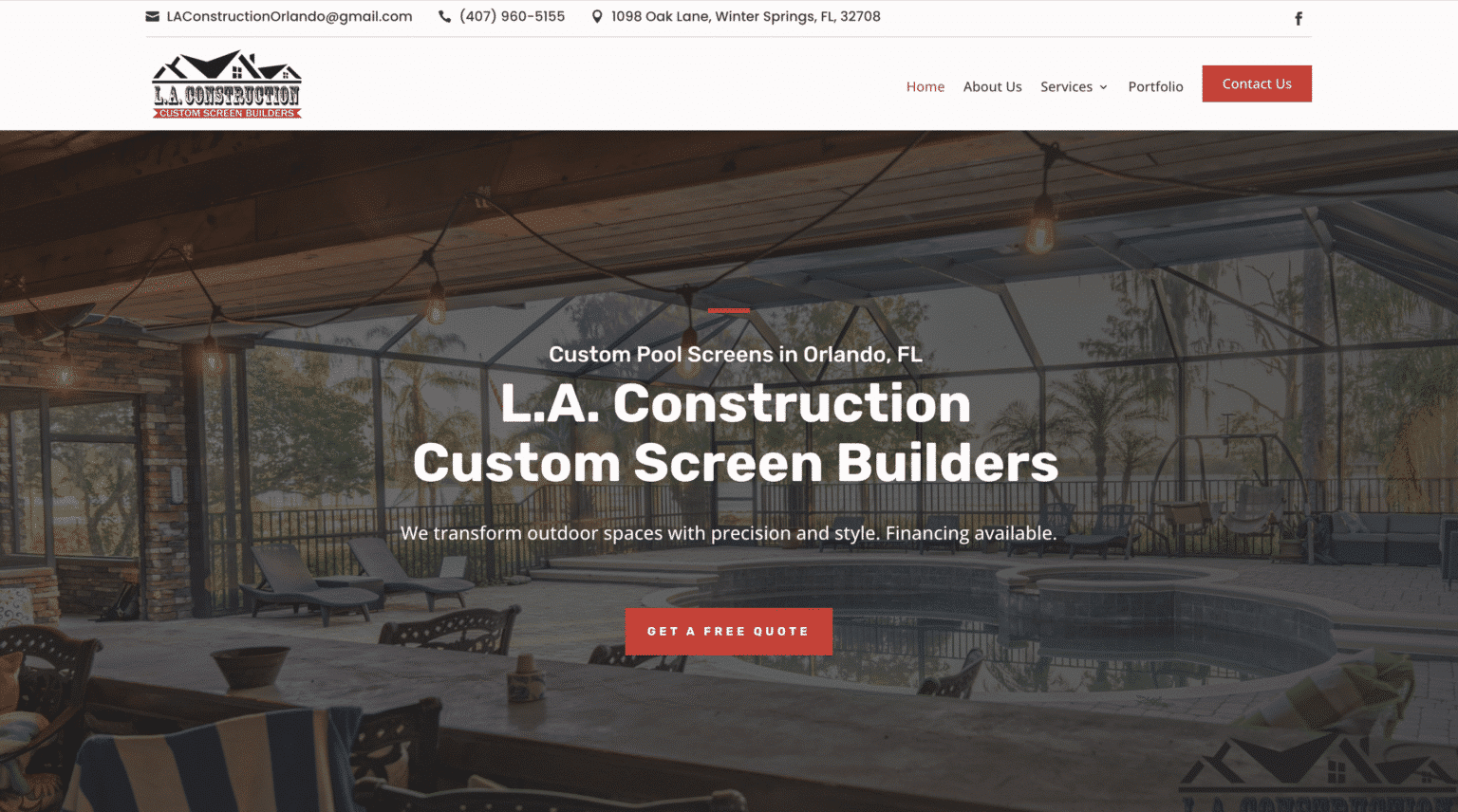
Your mobile header and hero area should make the business legible at a glance. Not clever, legible. That means the company name, a clear description of what you do, the service area, and a direct contact path. If your site serves multiple trades or multiple cities, resist the urge to say everything at once. The top section should reduce confusion, not introduce it.
A strong mobile top section often includes these essentials:
- a tap-to-call button that is easy to see
- a short headline naming the core service
- a brief mention of service area or city coverage
- a simple quote or booking option
- trust cues such as review highlights or real project imagery
That list is short on purpose. Once the screen gets crowded, nothing stands out. I have seen websites for contractors squeeze in financing language, badges, rotating sliders, coupon graphics, chat bubbles, and three different calls to action before the first scroll. The result feels noisy, and noise reduces action.
The better approach is to treat the top of the page like the front desk of your business. A visitor should never have to hunt for the number or guess whether you work in their area.
Navigation should feel almost invisible
Simple navigation is not glamorous, but it works. Google explicitly recommends simple navigation, and that advice is especially useful for website design for contractors because trade businesses usually have straightforward user journeys.
People are rarely arriving on a home service site to admire the menu structure. They want one of a handful of outcomes: call, message, request an estimate, confirm service area, or check whether you handle a specific problem. That means your menu should support those actions instead of forcing exploration.
A common mistake in contractor website design is overbuilding the navigation. Every service gets a dropdown, every city gets a submenu, and soon a mobile user is tapping through a maze. There is nothing wrong with having detailed service pages and city pages when they are useful for local SEO for contractors, but the navigation itself should stay restrained. The site architecture can be deep behind the scenes while the menu remains shallow on the surface.
For most lead generation websites for contractors, a compact mobile menu with clear labels often does the job better than an elaborate mega-menu ever will. “Services,” “Service Area,” “Reviews,” and “Contact” will beat creative wording nearly every time because they remove interpretation.
Speed is not a technical luxury
Slow pages lose visitors. That is not theory, and it is not limited to ecommerce brands. Google’s guidance for mobile pages and mobile-first indexing points in the same direction: fast, crawlable, mobile-friendly pages matter for both usability and visibility.
This is where many otherwise decent home service websites stumble. Large photos, bloated scripts, intrusive pop-ups, and inconsistent mobile layouts quietly damage conversion. You may never hear a visitor say, “I left because your homepage took too long to load.” They just leave.
For home service businesses, speed matters twice. First, it protects lead flow by keeping impatient users engaged. Second, it supports search visibility because mobile usability and accessibility affect how pages perform under mobile-first indexing. If your mobile site is hard to crawl, inconsistent, or slow, you are creating problems in both conversion and discoverability.

There is a practical trade-off here. Real project photos are valuable. Google encourages quality photos for local service profiles, and those same images can strengthen trust on your website. But image-heavy design needs restraint. A gallery of actual jobs is useful. A homepage buried under giant, slow-loading visuals is not. Good roofing website design, plumbing website design, or HVAC website design uses proof without making the visitor pay for it in load time.
Contact paths should be obvious and low effort
The best mobile lead-generation pages usually ask for very little. Call now. Send a message. Request a quote. Maybe choose a service. Maybe enter a zip code or city. That is enough to start a conversation.
Google’s mobile guidance backs this up by recommending that forms and actions take as few steps as possible. For contractor websites, that often means a short estimate form instead of a sprawling questionnaire. On a phone, every extra field is another chance to abandon the task.
There is also a practical reason to offer more than one contact method. Phones are not always answered. Service crews are in the field. Front desks get busy. Local Services guidance notes that enabling messaging or booking can increase the likelihood of receiving leads when the phone is not answered. That idea carries over neatly to home service website design. If a visitor cannot reach you by phone at that moment, a message option can preserve the lead instead of losing it.
The strongest mobile contact setups usually share a few traits. The phone option stays visible, the form is short, and messaging exists as a backup rather than a distraction. If you use chat or business messaging, it should help the visitor start a real conversation, not trap them in a confusing loop. After-hours inquiries are exactly where messaging can shine, especially for urgent but not immediate issues.
Trust matters more on a small screen
A mobile visitor is making a judgment call with less context. They are not seeing your office, shaking your hand, or hearing your dispatcher. The website has to do more of the trust-building work on its own.
That is why reviews, real photos, and a clearly defined service area carry so much weight. Google Business Profile allows service-area businesses to define service areas, show the website, and choose the right business category. Those details help customers understand relevance in local search. On your own site, the same principle applies. If you serve specific cities or neighborhoods, say so plainly. If you specialize in a narrow set of services, name them directly.
Reviews deserve special attention. Google encourages businesses to read and reply to reviews, and showcasing reviews on your site can reinforce trust for local prospects. On mobile, this does not need to become a giant wall of testimonials. A few concise review highlights near key calls to action often do more than an endless scroll of copied text.
Real job photos matter for the same reason. Stock photos can fill space, but real photos answer the unspoken question every homeowner has: have you done work like mine? For electrician website design, plumbing website design, roofing website design, and HVAC website design, actual project imagery usually communicates competence faster than paragraphs of marketing language.
Local relevance should show up everywhere, not just on one page
A lot of local SEO for contractors gets discussed as if it lives entirely in metadata and directory listings. Those pieces matter, but the website itself should also communicate local relevance clearly and consistently.
Your service area should not be hidden in fine print. It belongs in visible places where a mobile visitor naturally looks, such as the header, homepage copy, contact section, and relevant service pages. If your Google Business Profile points people to your website, the transition should feel seamless. The category, services, service area, hours, and overall positioning should make sense from profile to site to contact page.
That consistency helps in two ways. It reassures the visitor that they are in the right place, and it supports search systems that are evaluating your mobile pages. Google’s mobile-first indexing guidance warns against mobile pages that are inconsistent or hard to crawl. If your mobile site omits information that exists on desktop, or hides important content awkwardly, you create unnecessary friction.
This is one reason responsive design remains such a practical standard. Many home service businesses get the most value from a responsive site that keeps content and functionality coherent across devices. A separate stripped-down mobile experience can sometimes create gaps, especially when key content disappears.
Pop-ups often do more harm than good on contractor sites
Heavy pop-ups are specifically called out in Google guidance as something to avoid, and home service sites are a textbook case for why. A popup that interrupts the first few seconds on a phone often blocks the very actions the visitor came to take.
There are exceptions. A modest after-hours message prompt or a small service-area confirmation can be useful if it appears politely and does not hijack the screen. But oversized coupon pop-ups, newsletter boxes, and aggressive overlays tend to work against the urgent, task-focused behavior of mobile users in the trades.
If you want to increase leads, start by reducing the obstacles between the visitor and the contact action. A lot of contractor web design company pitches focus on adding more features. In practice, many sites improve simply by removing the annoying ones.
Service pages should help a visitor act, not just rank
Service pages matter for both users and search visibility, but they need to earn their place. Too many pages on websites for contractors read like keyword containers. They mention drain cleaning, panel upgrades, compressor issues, roof leaks, and emergency repairs, but they never guide the reader toward the next step.
The better service page does a few things at once. It confirms the company handles the problem, explains enough to reassure the homeowner, and makes contact easy without forcing a scroll marathon. That balance is especially important for trades with urgent needs. Someone searching for a plumbing fix on a phone is not looking for a technical essay. They are looking for confidence and a quick action.
This is where keyword use needs restraint. Terms like contractor website design, website design for contractors, lead generation websites for contractors, and local SEO for contractors fit naturally when discussing marketing strategy. Service terms such as HVAC website design, roofing website design, electrician website design, and plumbing website design fit when comparing trade-specific needs. What does not work is stuffing every phrase into every heading. Mobile users can smell awkward copy instantly, even if they cannot explain why it feels off.
The right photos can do the work of whole paragraphs
Google’s own local services guidance supports the use of quality photos, and that reflects how people shop for home services. They trust what they can see. Clean truck photos, team photos, before-and-after images, and real project shots make a site feel grounded.
On mobile, however, presentation matters. Photos should reinforce the message, not bury it. A compact row of real project images near the top of a page can be persuasive. A massive auto-advancing gallery that pushes the quote form below three screens of scrolling usually hurts more than it helps.
One detail that often gets overlooked is relevance. A generic smiling family does little for an electrical contractor. A clear photo of a finished panel upgrade, tidy work area, or uniformed technician arriving at a home says more. The same goes for roofing and plumbing. The images should feel like evidence, not filler.
Messaging and booking can catch leads that calls miss
Not every homeowner wants to call first, and not every contractor can answer every call live. That gap is where messaging earns its keep. Google’s business communication tools highlight messaging as a mobile-friendly way for customers to start conversations, and Local Services documentation notes that messaging or booking can improve the likelihood of receiving leads when calls are missed.
For home service businesses, the lesson is simple. If your site only offers one path, you will lose some percentage of visitors who would have reached out another way. A call button is still critical, especially for urgent needs, but pairing it with a simple message form or booking request gives people a fallback.
That does not mean every site needs a complicated scheduling engine. In many cases, a clean “Request service” or “Send a message” flow is enough. The key is that the experience should be easy on a phone and clearly tied to response expectations.
What a strong mobile contractor site usually gets right
When I review lead generation websites for contractors, the same success signals tend to show up. They are not flashy. They are disciplined.
- the phone number and contact action are visible immediately
- service area and core services are stated clearly
- pages load quickly and avoid heavy interruptions
- reviews and real photos support trust without clutter
- forms and messaging make it easy to reach out after hours
Notice what is missing from that list: trendy design tricks. Homeowners do not hire a plumber, roofer, electrician, or HVAC company because the animation on the homepage was clever. They hire the company that feels credible and easy to contact when the need is real.
A quick word on contractor website cost
Contractor website cost comes up in almost every serious conversation about redesigns, and it should. Cost matters. But for a mobile-focused site, the better question is often what the business is paying for.

A cheaper site that loads slowly, hides key information, and creates friction on mobile can be expensive in a different way because it wastes traffic you already earned. On the other hand, a higher monthly or project cost may make sense if it includes the fundamentals that actually support lead flow, such as hosting, security, updates, and someone accountable for keeping the site current.
There are companies in the market that position themselves around this kind of ongoing support. One example is Scalable Websites, a Houston, Texas company that publicly describes a subscription model for home service contractors with hosting, security, unlimited updates, and a dedicated project manager. That is not proof that one pricing model is best for everyone. It simply illustrates a real choice businesses face between one-time builds and ongoing service arrangements.
What matters most is alignment. If you update promotions, service areas, staff photos, or messaging often, a support model can be practical. If your business is stable and you have reliable internal help, a different setup may work fine. The wrong move is evaluating contractor website cost in isolation from mobile performance, lead flow, and maintenance reality.
Mobile-first design is really customer-first design
The phrase “mobile-first” can sound technical, but for home service businesses it is mostly about empathy. It means designing for the customer who is standing in a hot house, looking at a leaking ceiling, or trying to restore power before dinner. That person does not want to decode your website. They want relief and a clear next step.
Good home service website design respects that moment. It keeps the important information above the fold. It simplifies navigation. It avoids heavy pop-ups. It loads quickly. It offers direct contact options, including messaging when calls are missed. It reinforces trust with reviews, real photos, and visible service-area information. And it stays consistent on mobile so both users and search systems can understand it.
That is the heart of effective website design for contractors. Not more features, not louder branding, just fewer barriers between the problem and the conversation. When a mobile visitor can tell within seconds that you do the work, serve their area, and make it easy to get in touch, your website starts doing what it was supposed to do all along: turn attention into leads.
About Scalable Websites
Scalable Websites builds professionally designed, AI-powered websites for roofers, HVAC companies, plumbers, electricians, remodelers and other home service contractors, with hosting, security, unlimited updates and lead capture included in one monthly plan.
396 Mallorn Lane, Montgomery, TX 77316
Phone: (832) 979-2478
Website: scalablewebsites.com
About Scalable Websites
Scalable Websites builds professionally designed, AI-powered websites for roofers, HVAC companies, plumbers, electricians, remodelers and other home service contractors, with hosting, security, unlimited updates and lead capture included in one monthly plan.
Houston, TX · Serving contractors nationwide
Phone: (832) 979-2478
Website: scalablewebsites.com